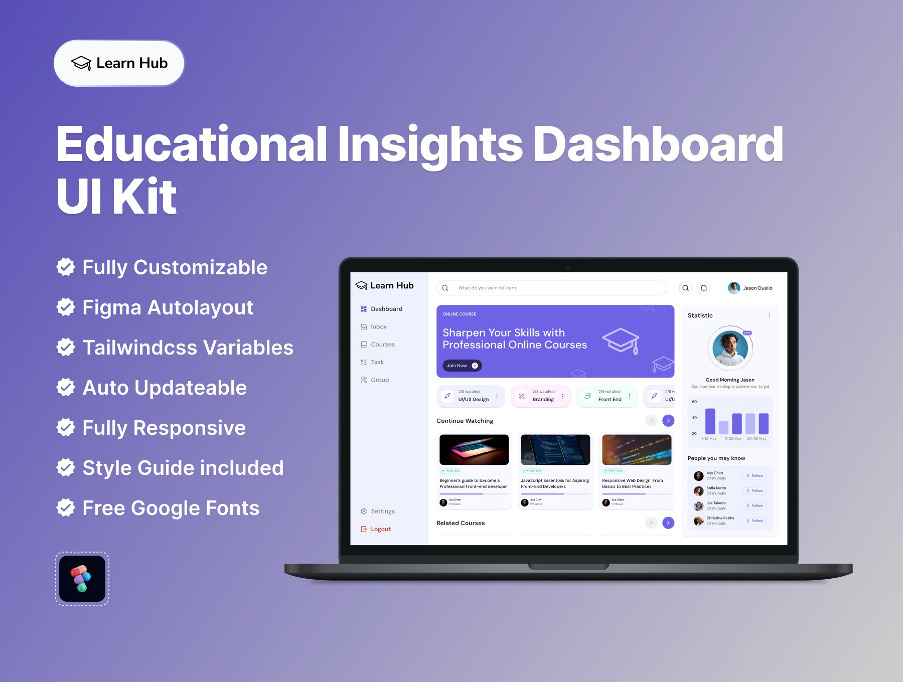
UKO - UI Kit & Dashboard Design System — Обширная дизайн система для создания дизайна приложений
А как у вас дела с английским?
Для развития, важно не просто смотреть вокруг, но и заглядывать за горизонт: изучать работы зарубежных дизайнеров и быть частью международного комьюнити.
Если вы можете поддерживать диалог на английском — это ооооогромный плюс для вас, как специалиста.
Ребята из онлайн-школы разговорного английского @authenticpigeon (подружилась с ними недавно) поделились фреймворком сообщения, которое поможет органично завязать профессиональный диалог с понравившимся человеком:
I saw *****. I liked *****. I’m curious about how/why *****?
Пример:
Hey Marco, I saw your SaaS dashboard design on Dribbble. I really liked the typography hierarchy and how calm the layout feels. I’m curious how you decided on those spacing and type scale choices — was it part of a larger design system?
Лучшее место для таких сообщений — комментарии в социальных сетях и на профессиональных площадках, типа 🅱️Behance, Dribbble и подобных.
Не бойтесь практиковаться и поддерживать уровень языка в проф. среде.
Подписывайтесь на телеграм-канал ребят, где они рассказывают о разговорном языке, который пригодится, когда будете общаться с зарубежными коллегами по цеху и клиентами → @authenticpigeon
Особенно, если цель выучить английский кочует в ваших списках из года в год. Может быть, это знак, чтобы заняться им всерьёз? ⚡️
GIF
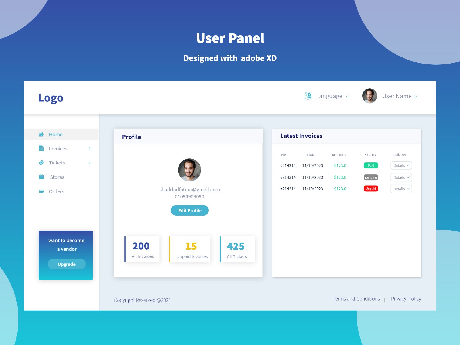
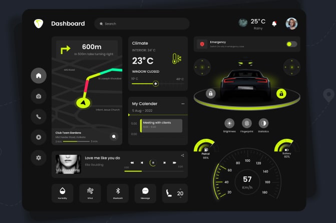
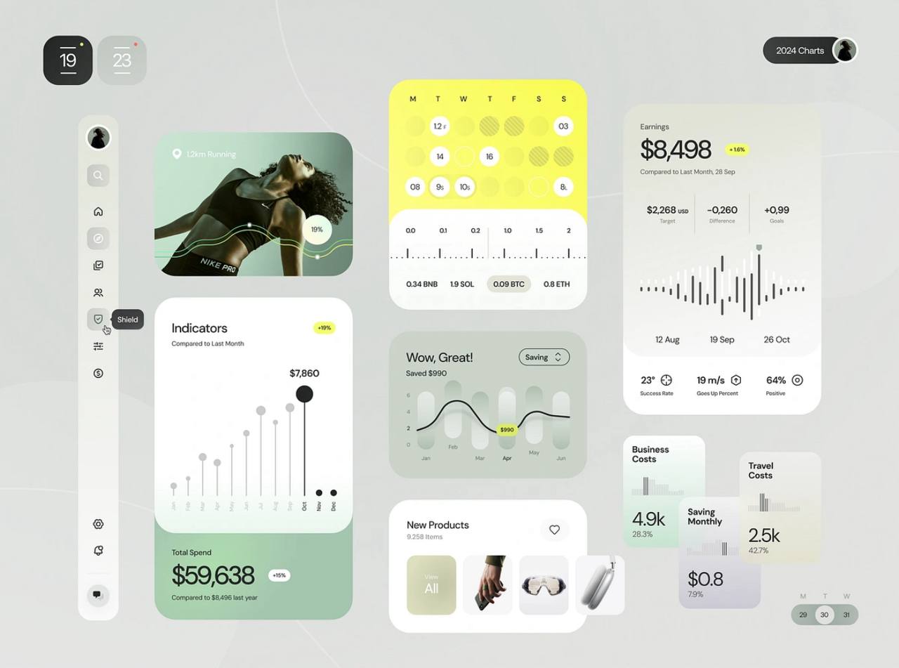
Elegant Dashboard — создайте интерфейс дашборда в 10 раз быстрее с помощью этого шаблона.
dashboard.elegant-goodies.com
Рейтинг-метр для панели управления.
• 4 уникальных состояния: высокий, средний, низкий и отключенный
• Идеально подходит для интеграции в темные и светлые темы
• Отлично подойдет для улучшения панелей управления и визуализации данных
• Легко настраиваемые элементы для разнообразных проектов
#rating #dashboard #design #visualization
Открыть в Figma