🔸 Ведущий архитектор в Архитектурное бюро Александры Федоровой:
https://archi.ru/vacancy/?id=2071">https://archi.ru/vacancy/?id=2071
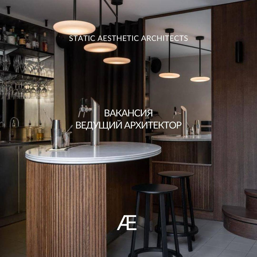
🔸 Архитектор в Static Aesthetic Architects:
https://archi.ru/vacancy/?id=2072">https://archi.ru/vacancy/?id=2072
🔸 Архитектор проектов благоустройства, детских пространств в Архитектурное бюро Дружба: https://archi.ru/vacancy/?id=2077">https://archi.ru/vacancy/?id=2077
🔸 Архитектор / ведущий архитектор в Градостроительный институт «Мирпроект»:
https://archi.ru/vacancy/?id=2074">https://archi.ru/vacancy/?id=2074
🔸 Архитектор в UMA:
https://archi.ru/vacancy/?id=2075">https://archi.ru/vacancy/?id=2075
🔸 Дизайнер интерьеров в MAAR DEVELOPMENT: https://archi.ru/vacancy/?id=2078">https://archi.ru/vacancy/?id=2078
🔸 Персональный ассистент в 5 corners lab:
https://archi.ru/vacancy/?id=2076">https://archi.ru/vacancy/?id=2076
🔸 Руководитель архитектурной мастерской в Градостроительный институт «Мирпроект»:
https://archi.ru/vacancy/?id=2073">https://archi.ru/vacancy/?id=2073
🌿🌿🌿🌿
Напоминаем, что мы публикуем вакансии бесплатно.
Присылайте их, пожалуйста, на job.archi.ru@gmail.com
Шаблон и формат здесь: https://archi.ru/files/archijob/">https://archi.ru/files/archijob/
#вакансии