Чувствительность к регистру
Чувствительность к регистру
@case_sensitivity
625 подписчиков
17 постов
Посты

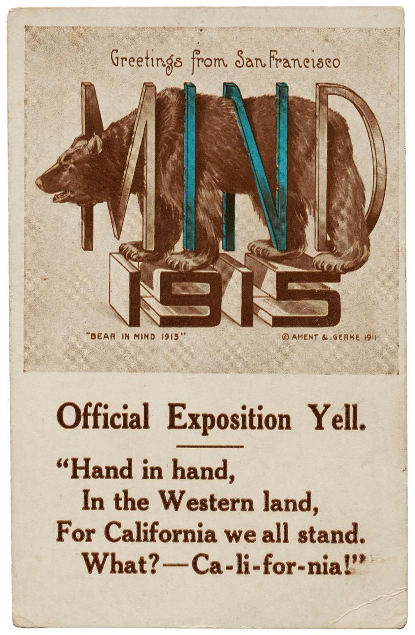
Не знаю, как насчет верблюда в игольное ушко, а вот медведя в буквы пропихнуть — нет проблем.
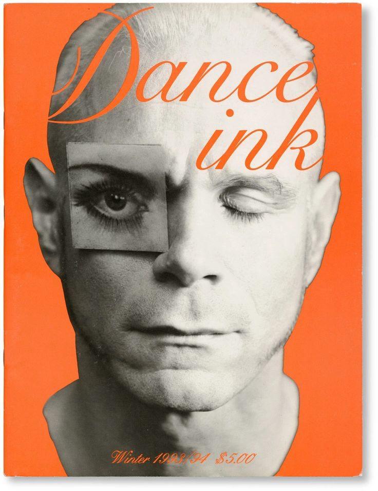
Dance Magazine
by Abbott Miller
5 долларов в 1994 году.
2 краски.
2 изображения.
2 строки названия журнала.
2 года — охват.
#magcover #typography
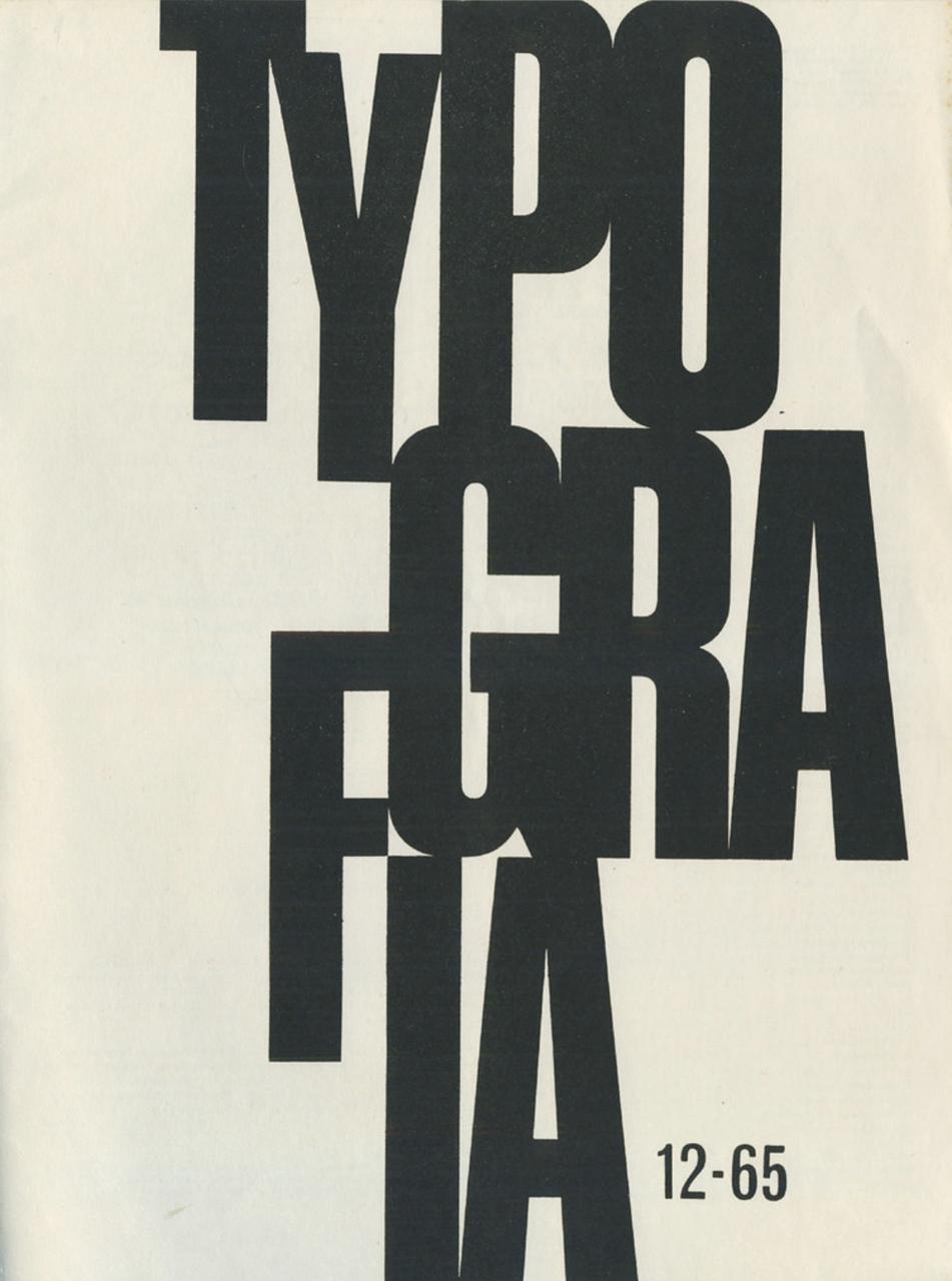
Cover Typografia 12/1965. Technical Journal of Czechoslovak Printers
Cover design: Vladislav Najbrt
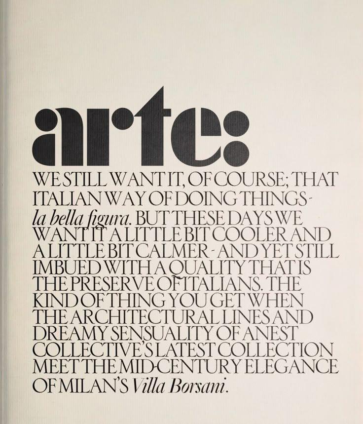
Уплотнение.
#magcover #typography
строчные (начало) — плотно и трафаретом;
прописные (основное сообщение) — очень плотно;
курсив (строчные) — на ключевые слова.
#typography #trick
Pep Typeface
by Dries Wiewauters
2019
Pep is a typeface that explores the limits of the childs game “ABC Con Fantasia” by Bruno Munari.
#typedesign #modulus
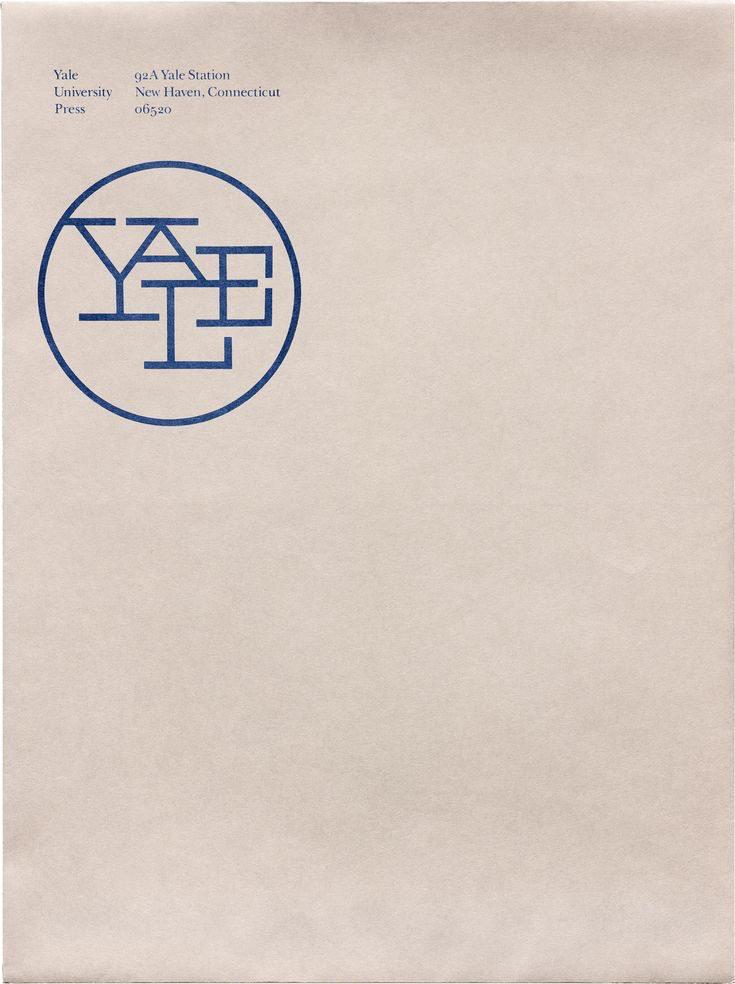
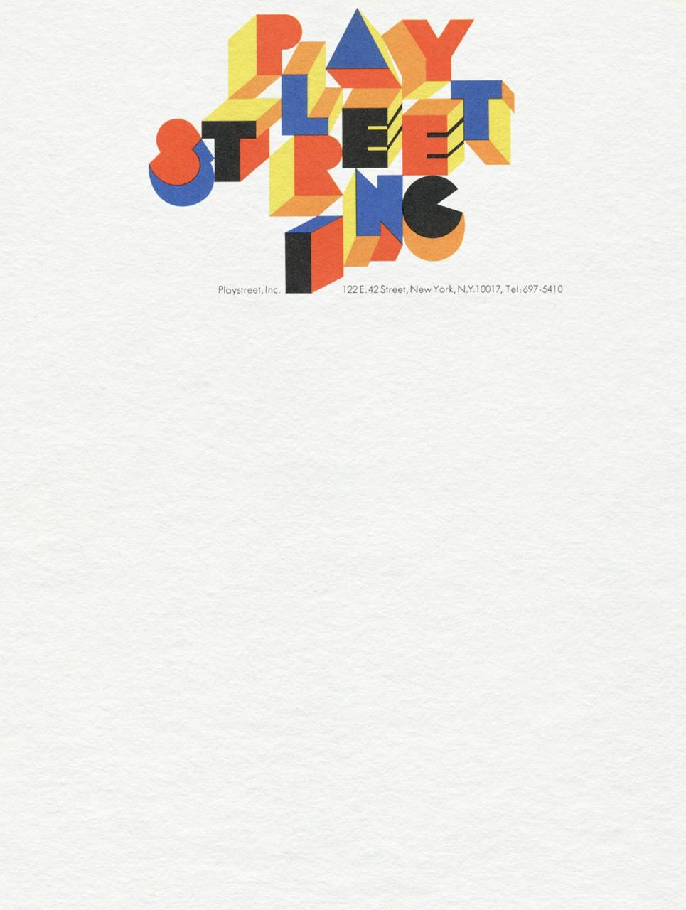
Playstreet, Inc. were a New York architecture firm reinventing children’s playgrounds in the 1960s through bold, modular design—and this was their letterhead. Created by Herb Lubalin’s agency, Lubalin, Smith, Carnase Inc, it was art directed by Annegret Beier and lettered by Tom Carnase.
Vietnam Festival of Media & Design: Hanoi 2019
by behalf studio
The highlight of the visual expression is its bespoke typeface and design system. Ba Đình, a bold geometric sans serif, is a juxtaposition of Hanoi’s culture and media/design contexts. We came up with a system that not only translates the idea of Hanoi as a multi-layered cultural city, but also realizes the potential of having multiple variations.
#custom #typeface
Согласно наставлениям. 🔝🫣
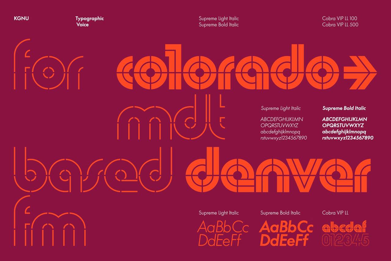
KGNU by order
KGNU (1390 AM & 88.5 FM) is a radio station serving the greater Denver and Boulder areas in Colorado.
LL Supreme Bold and Light, by Lineto→, are used for legibility and clarity in the brand.
Their construction mirrors the geometry of LL Cobra VIP.
LL Cobra VIP, also by Lineto→, is used as the primary identification of the logo, and as a graphic support to the extended brand language.
#typeface #identity

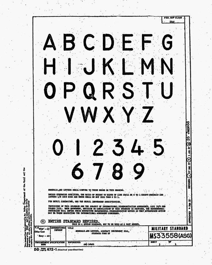
Прекрасный образец шрифта стиля mis-serif. 😊
The font’s name is Gorton
Эта картинка — анонс развернутого и богато иллюстрированного рассказа про историю шрифта Гортон. Прекрасное.
#typedesign #wow
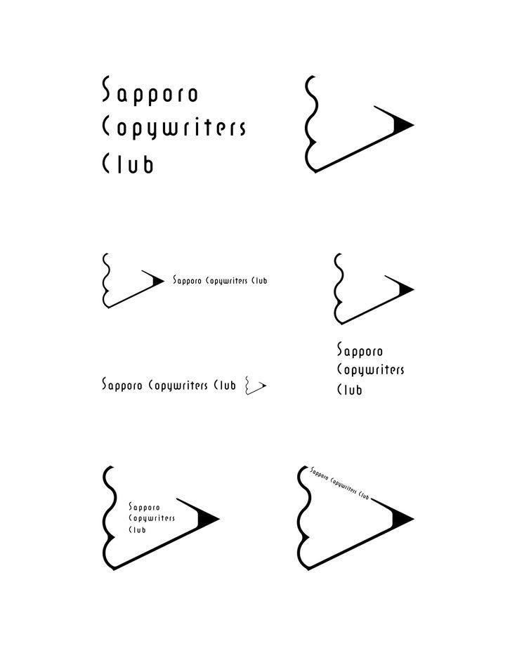
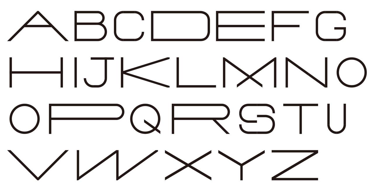
Typeface
by workroom
Довольно логично, на первый взгляд. Пропорции знаков определяются геометрией и желаниями автора получить особую выразительность в наборе.
🎬———>> wwwwwwww
#typedesign #logico #custom #typeface
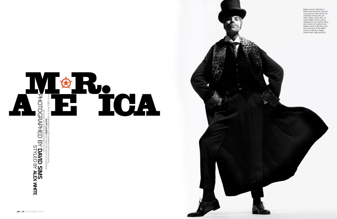
Barneys New York Magazine Women’s Spring 2016 (_Edward_Leida_)
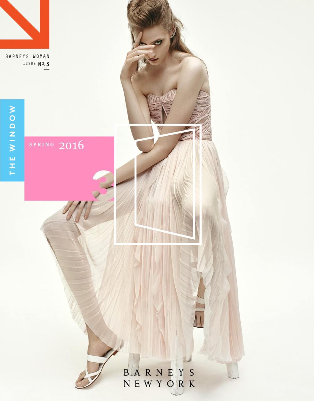
W Magazine
Edward Leida
Подскочило и отскочило. Экономно.
#editorial #typography