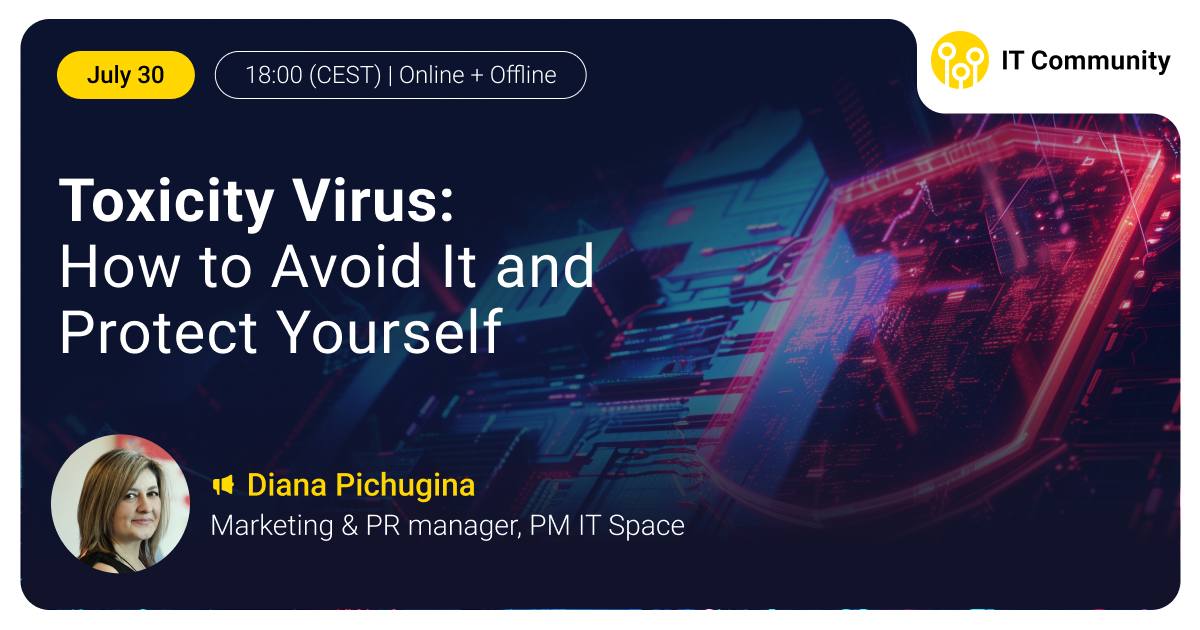
Interface designers

Interface designers

@interfacedesigners
Изображение канала: Interface designers
2 469 подписчиков
3 поста
Посты
We can debate for ages on what’s more important: hard skills or soft skills…
And that’s what we’ll be doing at the meetup on June 26! 😁 Which is more important at the start of your career: strong hard skills or well-developed soft skills? When do soft skills become the decisive factor? Why is speaking the language of business a must-have for developers, QA engineers, and analysts? Our speakers will break down these and other questions using their experience 👇 🎤 Artem Golovachev, Solution Architect with 14 years of experience in the IT industry 🎤 Vitali Birchanka, Lead Presales Business Analyst with 8 years of experience as an IT business analyst 🎟 Register here ⏰ Time: 17:30 (CET) ⏳ Duration: 1–1.5 hours 🗣 Language: English 💻 Online: The link to the stream will be sent to your email specified in the registration form Traineeships at Andersen: 📱 Telegram 📱 Apply for a traineeship
Изображение поста
What Keeps 300M Users Coming Back? Duolingo’s 8 Smart UX Moves 🎯
A deep dive into how one of the world’s most addictive learning apps keeps users coming back, day after day🤔 Duolingo masterfully uses emotional design, smart defaults, and subtle psychology to build habits. Want to learn how they do it with visual storytelling and UX breakdowns? 👉 Check out the full case study • 5 min read ❤️ Like this post if you want more UX breakdowns like this
Изображение поста
📊6 UX Design Mistakes to Avoid When Designing Dashboards
Dashboards can be powerful—or painfully confusing. Before you ship your next design, make sure you're not falling into these all-too-common UX traps: 1. Poor Navigation Structure 2. Ignoring the User’s Mental Model 3. Using the Wrong Data Visualizations 4. Relying on Static Content 5. Excessive White Space and Padding 6. Not Designing for Different User Roles 👀 Want to know how you fix that? 🔗 Read the full article 🔗 • 4 min read
Изображение поста
Apple has introduced a new visual language: Liquid Glass🫧
There are two styles to choose from: 🪞 Regular – versatile and adaptive, offering full support for behavior and readability 🫧 Clear – more transparent, ideal for bright media backgrounds, though it may require dimming for better contrast ❗️They should never be mixed, as each has its own characteristics and specific use cases. Watch the full video: 📹 Core Principles of Liquid Glass It's been less than a couple of days since the reveal, and designers are already split: Some are quick to criticize😡while others are blown away😍 One thing’s for sure — it’s hard to stay indifferent ❤️‍🔥 What about you? 👍 if you're all in on Liquid Glass 👎 if you're not convinced
Video is not supported
🧭 User Journeys vs. User Flows: What’s the Difference?
Both are essential UX tools—but they zoom in on very different things. 📌 User Journeys = Big-picture thinking. They map the full experience across time and touchpoints—emotions, thoughts, and behaviors included. Example: Searching for a new doctor, checking reviews, booking an appointment, and finally visiting the office—all across different platforms. 📌 User Flows = Laser focus. They show the exact steps a user takes within a product to complete a task. Example: Logging into a patient portal and checking lab results from your first visit. When combined, journeys and flows offer both macro and micro views—a must for truly user-centered design. 👉 Read the full article
Изображение поста
📲 Designing Arabic Apps: What to Know About RTL Layouts
🔹 Mirror Layouts, Not Just Text Icons, navigation, and gestures should flip too (e.g. back button) 🔹 Typography Matters Arabic fonts have unique proportions and flow. ✅ Use legible, culturally appropriate fonts like Cairo, Noto Sans Arabic 🔹 Align Right, Not Center Default alignment should be right for text and elements. 📝 Forms, headings, and paragraphs should feel native to the reader. 🔹 Watch Out for Icon Directionality Directional icons must be mirrored. 🔁 Arrows, progress indicators, and sliders should respect RTL flow. 🔹 Images May Stay LTR Lifestyle/product photos often remain left-to-right to preserve intent. 🔹 Language Impacts UI Density Arabic text can take more vertical space—adjust line height and padding accordingly. 🔹 Consistent UX Flow Navigation patterns (e.g., swiping) should feel intuitive in RTL. Right swipe = back action 🔗 Read the full article 🔗
Video is not supported
#course
Andersen invites you to join its free online intensive course in UX/UI Design ⭐️The best students will be offered to take part in a traineeship with subsequent employment in our company. 📍Locations*: - Georgia - Kazakhstan - Azerbaijan (Baku) *including relocatees. Online intensive course: 📌 Start — Summer 2025; 📌 Course duration — 2 months. 📌 Training session duration: 2 hours. 📌 Practice + home assignments 📌 Language of training is English. 📌 Mentors: Middle and Senior UI/UX Designers of our company with real experience of working on projects with varying complexity. All requirements for candidates, additional information, and the registration form can be found HERE
Изображение поста
7 Hottest UI Component Libraries of 2025 — Copy and Paste
If you’re looking to save time and effort while creating polished designs, this list of the best free, open-source, copy and paste UI component libraries is for you. 🎥 Watch the video 📚 Read the article
Изображение поста
Wanna take a behind-the-scenes look at how top brands organize their design systems?👀
Figma just launched a new series on their YouTube channel — Deep Dive with Jay — where they explore the Figma files of top designers. In this episode, Design Lead at Uber shares how the team builds new components, specs them for developer handoff and more. A must-watch for anyone building or scaling a design system. 🔗 Watch the full video 🔗 Wanna see more behind-the-scenes design content like this? Hit fire emoji if you're in! 🔥
Video is not supported
Изображение канала: Interface designers
6 Dimensions for Assessing Usability Data in Analysis
“I like it.” 💁‍♂️ 🙋‍♀️ But… did they really? When analyzing usability test data, not every comment should be taken at face value. Each data point deserves a deeper look through 6 key lenses: 1️⃣ Authenticity 2️⃣ Consistency 3️⃣ Repetition 4️⃣ Spontaneity 5️⃣ Appropriateness 6️⃣ Confounds Use this mnemonic to help you remember them: All Curious Researchers Stop and Analyze Carefully. What’s your go-to method for digging deeper into user feedback? Share in the comments 💭 🔗 Read the full article 🔗
Изображение поста
Изображение канала: Interface designers
Hey there, design lovers👋
Video is not supported
Изображение канала: Interface designers
Welcome to the new era of Figma🔥
Here’s a quick recap of the biggest updates from #Config2025: 💻 Figma Sites – build and publish fully responsive websites directly in Figma. No code required. ⚙️ CMS for Sites (expected later this year) – update content visually, no coding needed. 🖌️ Figma Draw - gives finer control of vector editing and new tools for illustration: brushes, dynamic strokes, texture, noise, text on paths. Freehand drawing right in your design files. 📏 Grid - is a new auto layout option that helps designers create responsive designs. Span elements across multiple cells and watch layouts adjust in real time as frames are resized. 📝 Figma Make – a new promt-to-code capability to help designers quickly explore, iterate, and refine. 🐝 Figma Buzz – AI-assisted content generation & templates for teams creating content for social media. Which feature are you most excited about? Let’s discuss in the comments 💭
Video is not supported
Изображение канала: Interface designers
UI Design Trends in 2025 🔥
Designing for 2025 goes beyond following trends — it's about building meaningful, user-centered experiences that drive real impact. Explore the key UI design trends shaping the year ahead👇 📌 Big Typography 📌 Brutalism 📌 Morphism 📌 Text Transitions 📌 Emoticons 📌 Lightning Dark 📌 3D Elements 📌 Bento Grid 📌 Interactive Objects Read the full article: 🔗 Link 🔗 Which trend resonates most with you? Share your favorite in the comments💭
Изображение поста
Изображение канала: Interface designers
📊 Designing Big Data Tables: UX/UI Essentials
🎯 Purpose-Driven Design: Understand your users (analysts, sales teams, or admins) to tailor the table's functionality. 👁‍🗨 Data Clarity: Ensure text is readable and numbers are properly formatted for easy scanning 🧑‍💻 User Workflows: Design for tasks like viewing, editing, or comparing data, incorporating inline editing and bulk actions where necessary ⛰ Visual Hierarchy: Use headers, alignment, and spacing to guide the user 📈 Scalability Features: Implement pagination, sticky headers, and frozen columns to manage large datasets effectively ⚙️Advanced Interactions: Provide multi-level sorting, dynamic filters, and column customization for enhanced user control 🏎 Performance Optimization: Utilize libraries like AG-Grid, DataTables.js or Material-UI Table to handle large data efficiently 📲 Mobile Responsiveness: Prioritize essential data for smaller screens Check out the full article: 🔗 Link 🔗 Tap 👍 if you found this useful
Изображение поста
Изображение канала: Interface designers
How to supercharge your UX workflow with AI? 🤖
A McKinsey survey reveals: 65% of companies already use generative AI — and overall AI adoption has skyrocketed to 72%! Don’t get left behind👀 Here’s what you can automate starting today: ⚡️User Research: Auto-generate interview questions, summarize findings, and even predict user behavior. ⚡️Ideation: Spark creative ideas with AI-powered brainstorming tools. ⚡️Wireframing: Instantly build wireframes from simple prompts. ⚡️User Testing: Analyze usability tests with lightning-fast AI insights. ⚡️Content Generation: Draft UX writing (like microcopy) in seconds. 👁️‍🗨️ Discover a 4-step starter kit packed with tools and prompts: 🔗 Read the full article 🔗
Изображение поста
Изображение канала: Interface designers
Figma designs, animated with AI✨
Lottielab launches Magic Animator – a game-changing AI tool for animation directly inside Figma 🔜 ▫️Fully integrated with Figma ▫️Analyzes layout & structure to generate smart UI motion ▫️No manual setup needed This could seriously change how we approach motion in UI design, don’t you think? 🔗 Source
Video is not supported
Изображение канала: Interface designers
📈 Design a line graph in Figma in just a few clicks
1️⃣ Create and select a frame or rectangle where you want the graph to appear 2️⃣ Open the Sparkliner plugin from the Figma toolbar 3️⃣ Customize the look — toggle dots and apply smooth curves 4️⃣ Enter your data (e.g., 5, 10, 7, 12, 9) 5️⃣ Click Generate ✔️ Your graph will appear instantly inside the selected frame — clean, scalable, and fully editable. 🎥 Follow this video tutorial to see it in action and get inspired! (Source: @janm_ux) Like this tip? Tap ❤️ and share it with your fellow designers
Video is not supported
Изображение канала: Interface designers
How to make your job title sound 300% more important on LinkedIn
Изображение поста
Изображение канала: Interface designers
🚨 Managers vs. Burned-Out Employees!
Want to know what managers do? Support, pressure, or pretend everything’s fine? 👇 See the poll in Typical Manager and Vote – the truth must be heard! 💥
Изображение поста
Изображение канала: Interface designers
#course
Andersen invites you to join its free online intensive course in UX/UI Design ⭐️The best students will be offered to take part in a traineeship with subsequent employment in our company. 📍Locations*: - Georgia - Kazakhstan - Belarus - Azerbaijan (Baku) *including relocatees. Online intensive course: 📌 Start — June 2025; 📌 Course duration — 2 months. 📌 Training session duration: 2 hours. 📌 Practice + home assignments 📌 Language of training is English. 📌 Mentors: Middle and Senior UI/UX Designers of our company with real experience of working on projects with varying complexity. All requirements for candidates, additional information, and the registration form can be found HERE
Изображение поста